Raft.mk

A one-of-a-kind online grocery

back to portfolio
  • webapp
  • react
  • ux
  • development
  • cloud
  • oblax

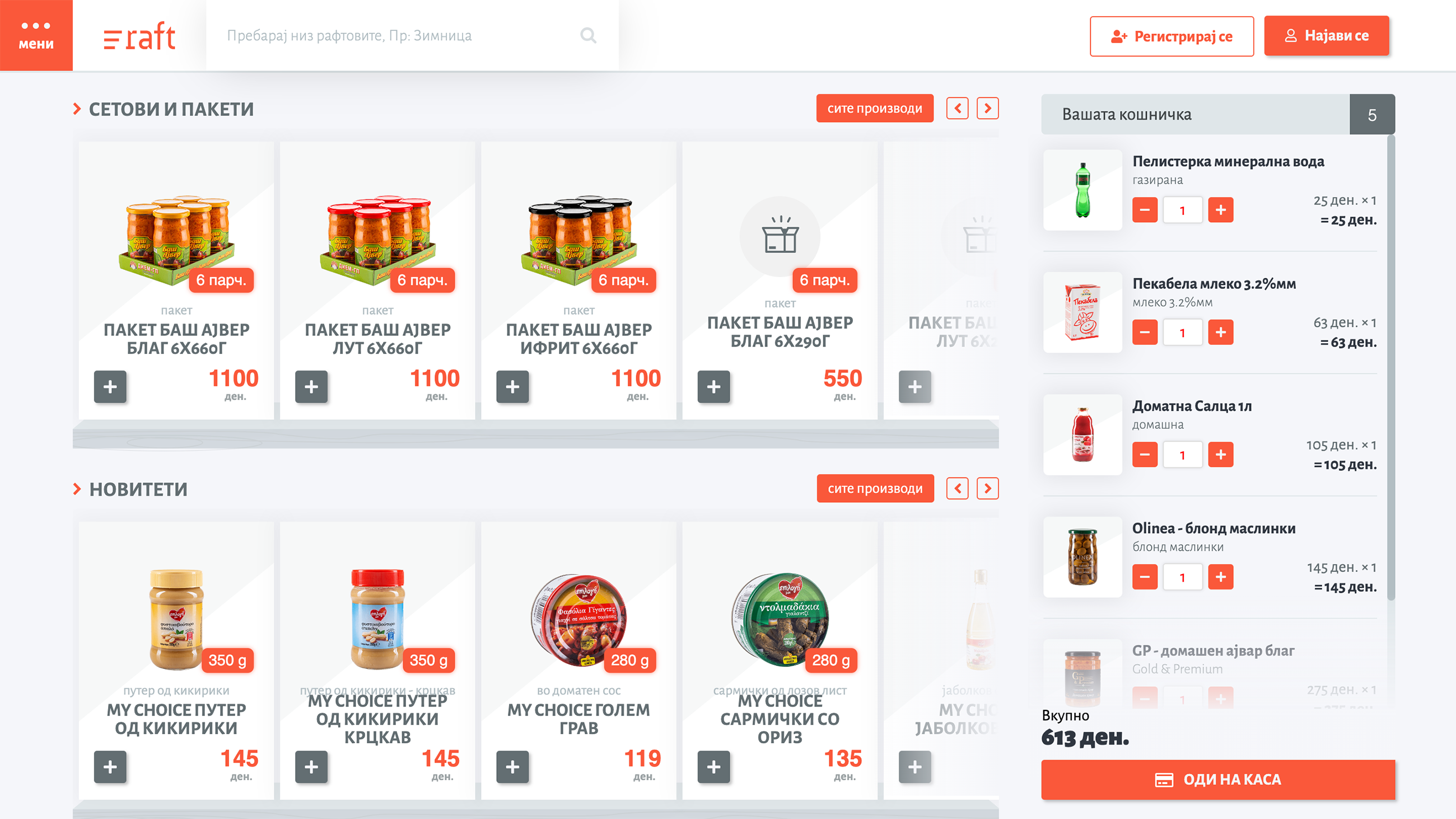
Raft.mk is the best web application for online shopping in Macedonia with over 1,500 product available, carefully sorted into 35 categories. We designed and developed this app with the idea of creating an accessible, and more importantly affordable place for online grocery shopping. Based on the Oblax backend engine it delivers a modular store that is delightful to use on the desktop, but also on a mobile device.

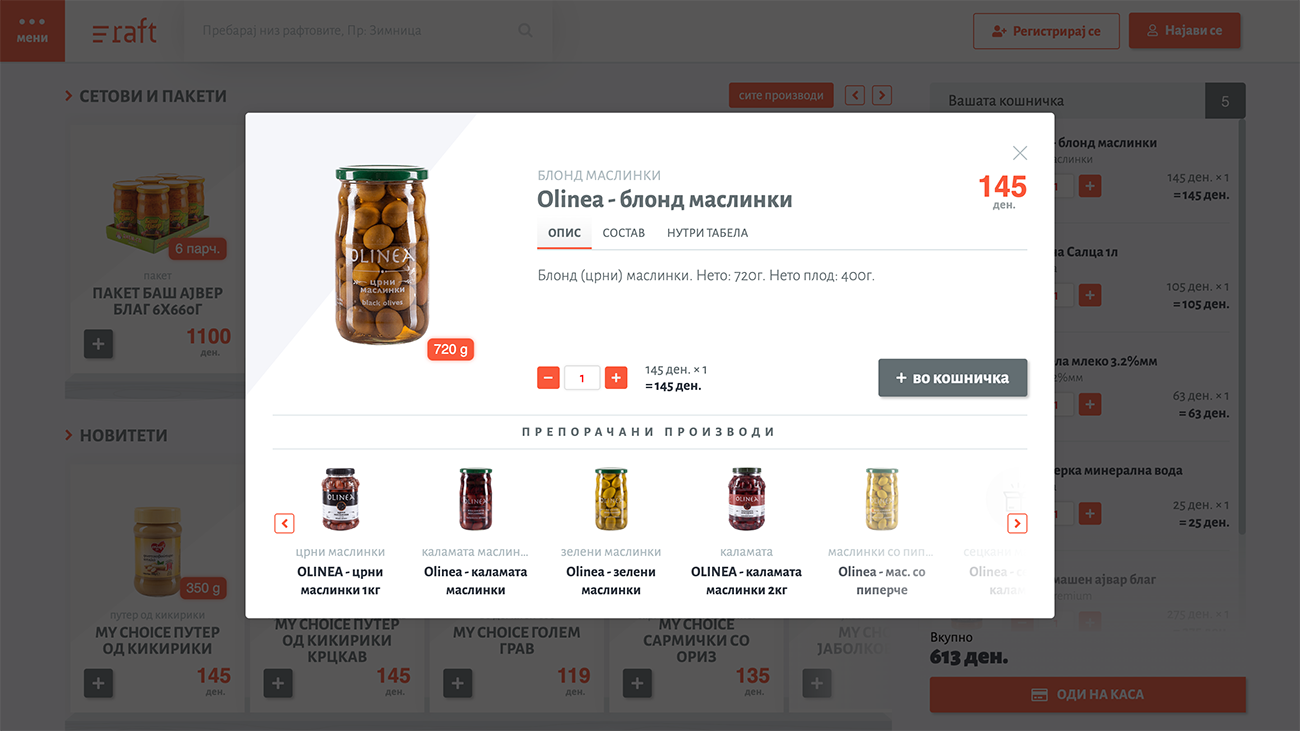
Product Quick-View

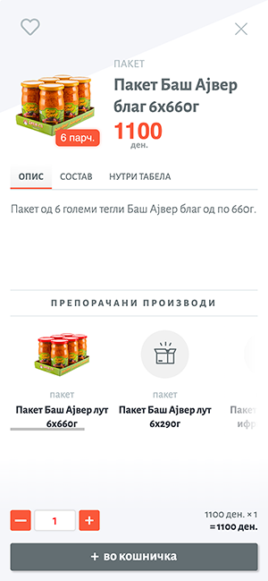
A simple popup window containing all the product’s information. A large image so the user can easily identify the product, the name, description and the price, all in the top part of the popup. An easy to use, but also mobile friendly in size control for manipulating the number of items, and a big “add to cart” button.

At the bottom of the popup we list related or suggested products.
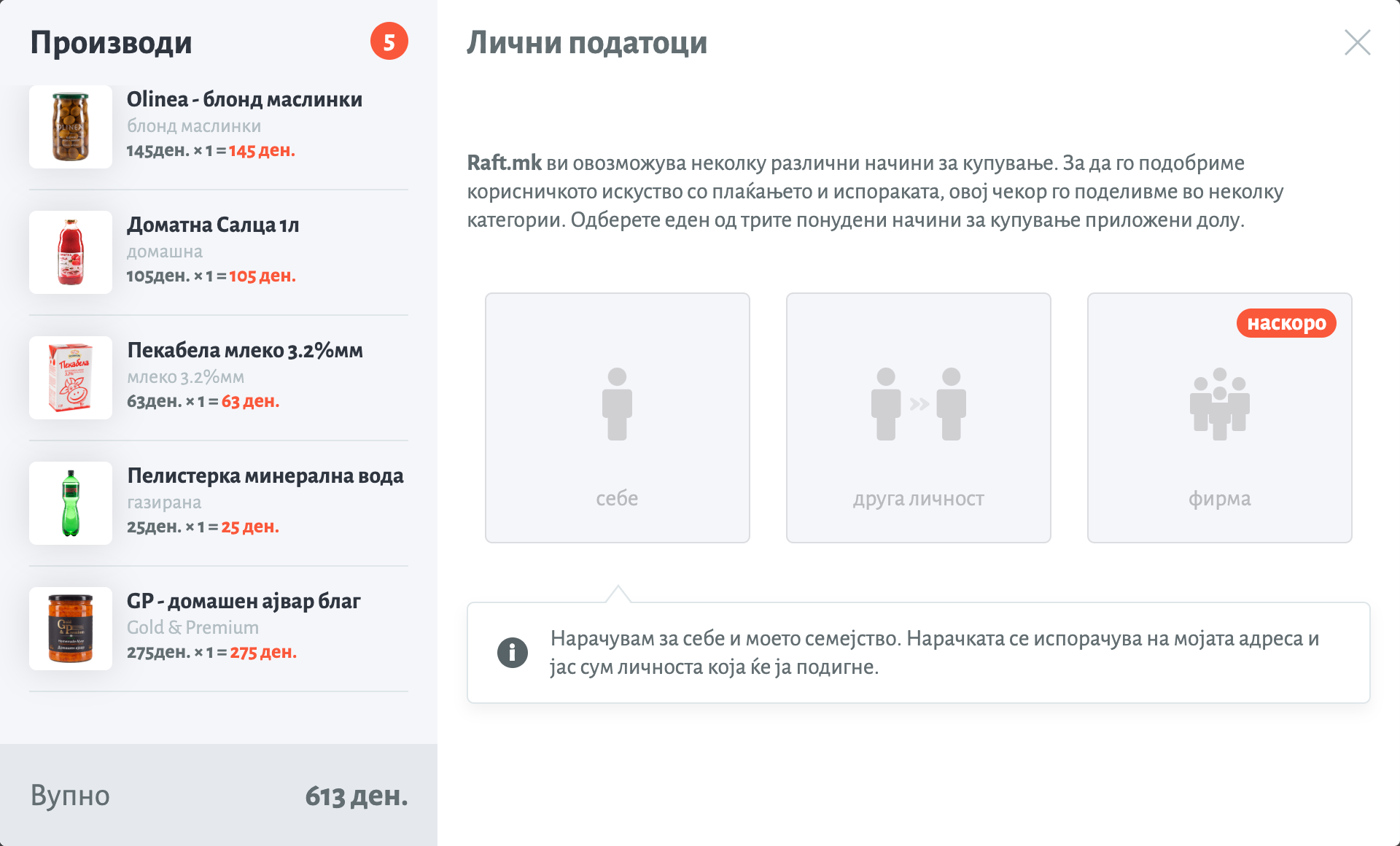
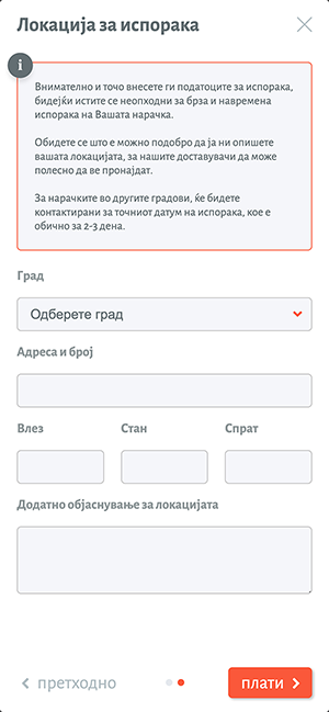
Checkout Choices

The Raft’s checkout gives you three different checkout options. Personal order, ordering for someone else, or ordering for a business. All these activate a wizard with mainly similar options for each of the types. The differences are that when ordering for someone else, you can enter the details for the person that will actually receive the order, and when ordering for a business you can enter the businesses details, and choose to pay using an invoice.

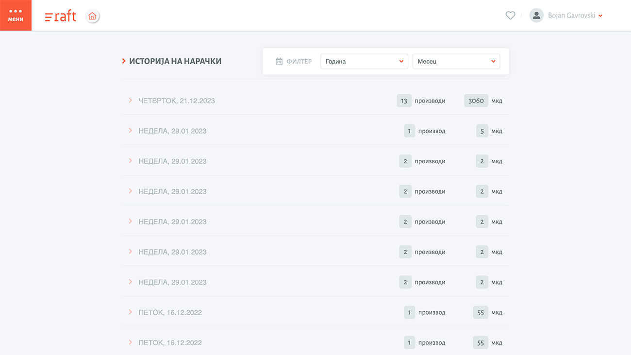
Order History

Each user gets their own order history. It’s a nice way of keeping track of what has been ordered and when. You can check the ordered items and the prices, and also you can download an invoice for the particular purchase. Each order is represented as a separate line in the list, but when clicked a detailed list is shown, containing all ordered items with their price and count.

At the top of the list there is a filtering bar which allows you to filter your orders by year and month.

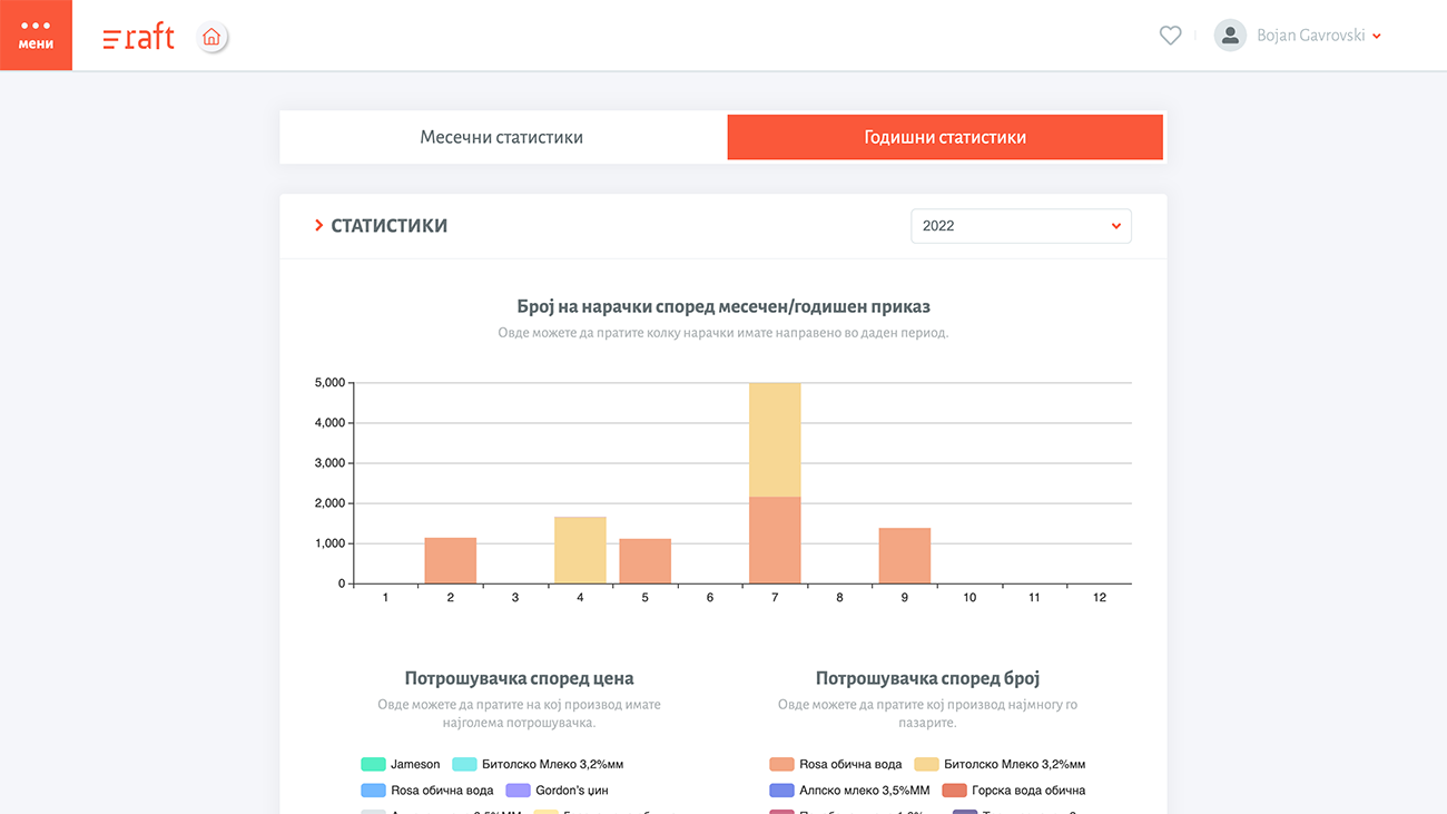
Spending Stats

Probably one of the most used parts of the app. Everyone loves statistics, especially when it comes to their hard earned money. Raft.mk offers two different stats to its users, spending by number and spending by price. Spending by number just count the number of items purchased in a certain period of time. An example of this would be, you bought 20 Skopsko beers this month. The spending by price calculates where did you spend most of your money.

These stats allow the user to make wise decisions about their shopping, and maybe creating a better shopping list next time around.

Multiple Delivery Locations

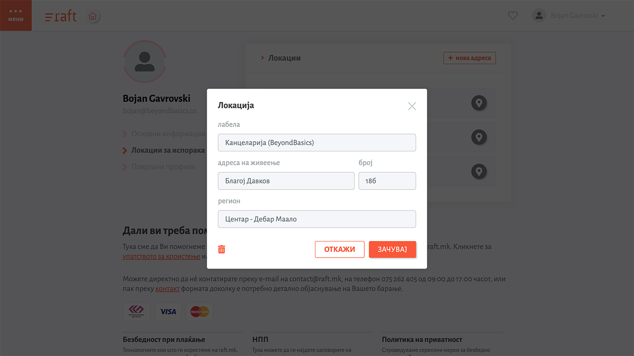
Yes, it’s not a big deal, but it can be annoying at times if you are doing your regular order and all of a sudden you need to enter your home address for the billionth time. Just select it from the dropdown and carry on. It’s that easy.

Responsive design

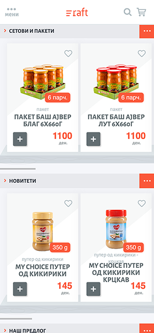
There is now way of creating an e-commerce experience without taking care of how people use it from their mobile device.

Raft is not just optimized for mobile devices, but it was also developed as a PWA (progressive web app), which means it utilizes system API to bring the webapp to the next level of usability. When opened it will ask you whether you want to install it on your desktop, and when clicked yes, it will seamlessly blend with all your store installed apps. We also utilize local data storage to keep a local copy of the products, so if there is no internet connection, you’ll still be able to browse the store products.

Every action has been rethinked and optimized for mobile users so they too will get a top-notch experience using it.

Mobile-friendly Checkout

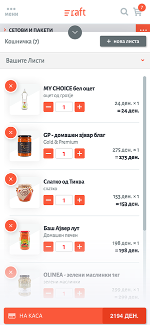
The most problematic part of any mobile e-commerce app is its checkout procedure. Sometimes a poorly “translated” desktop experience can cause tremendous harm to a store, and that’s why we developed this part as a separate from the one for desktop users. On mobile, re-did the shopping cart and the whole checkout workflow just to make it easier for mobile users to finish their shopping in seconds rather than minutes.