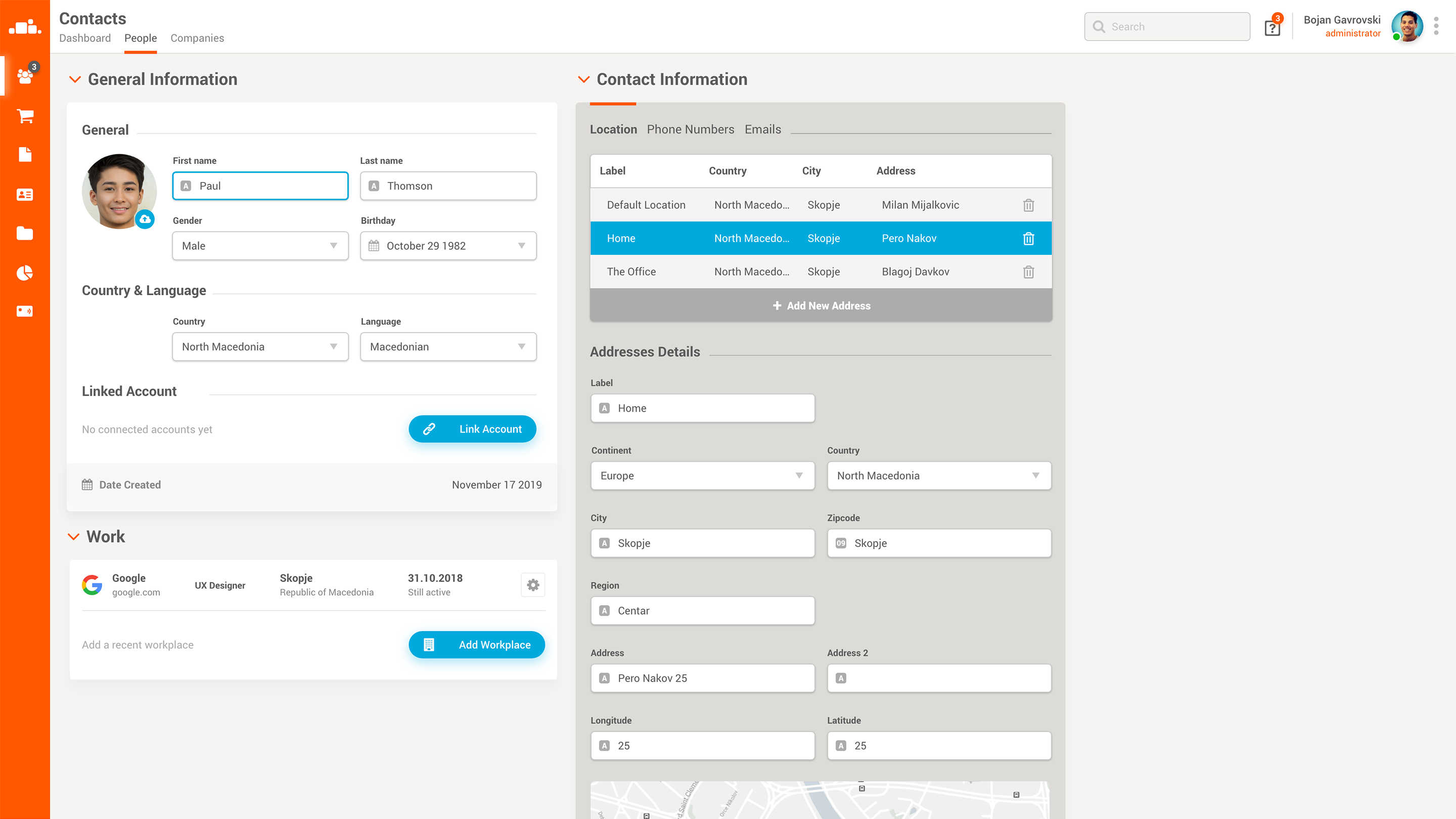
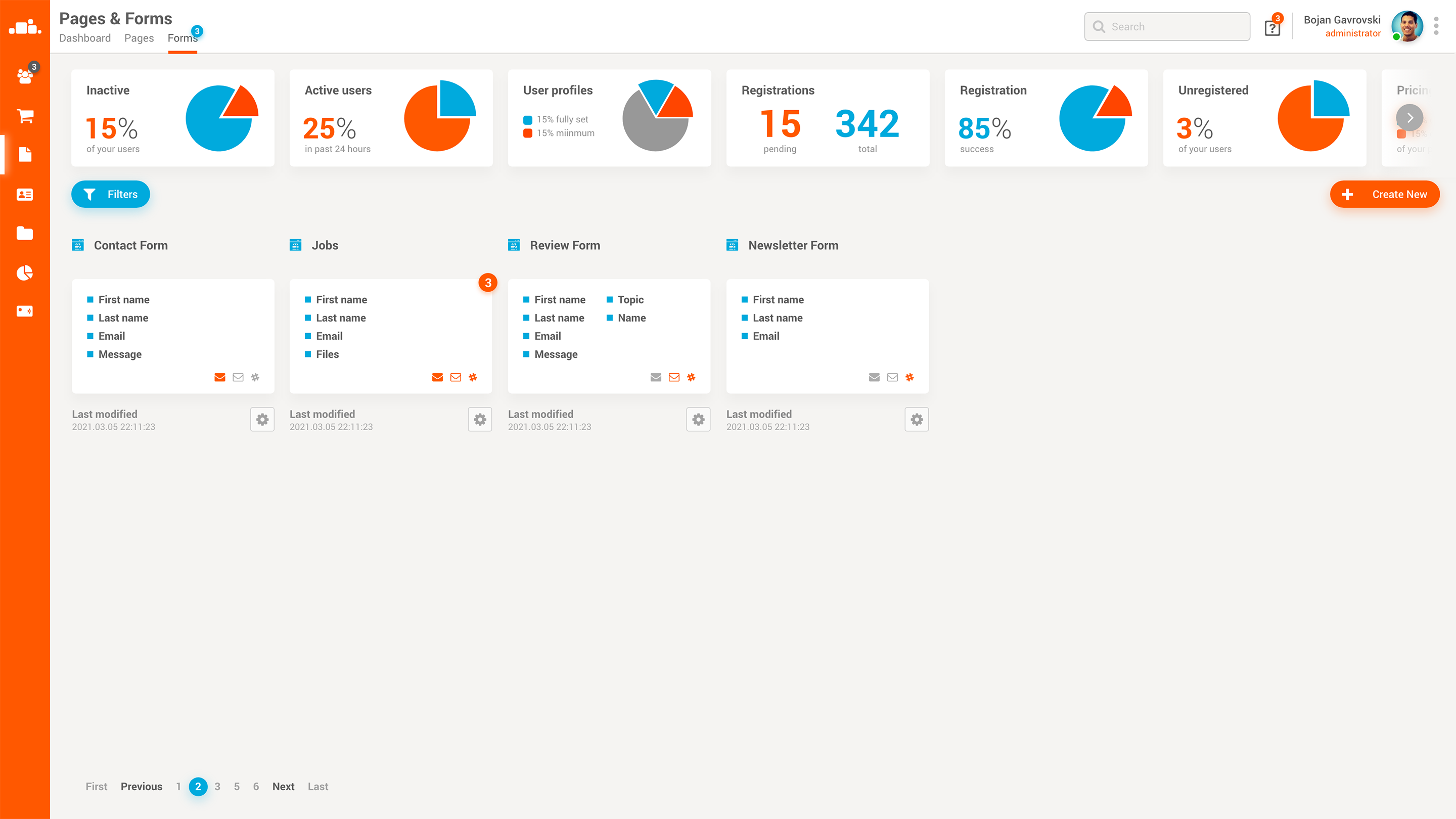
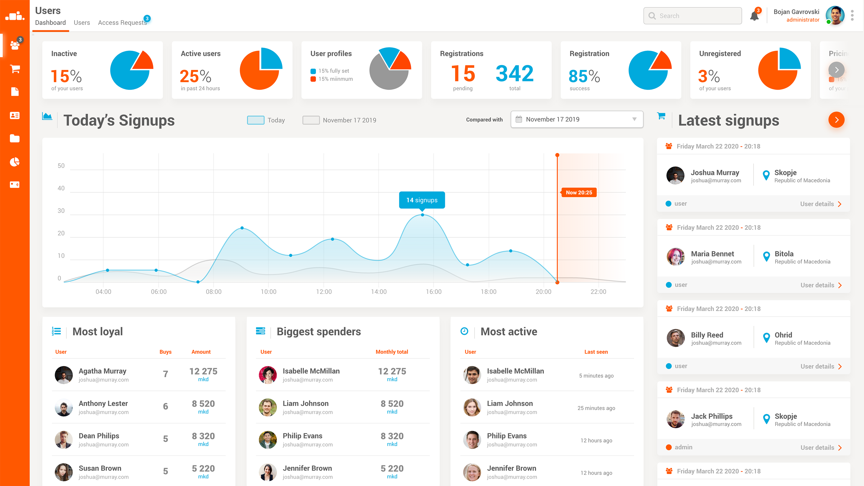
Oblax BackOffice

Administrative panel for Oblax applications

back to portfolio
  • oblax
  • back_office
  • web_app
  • react

Oblax v1 (BoosterCloud at the time) already existed as a cloud API platform, but there was no GUI app that would enable our clients to start using it. Of course, we had SDKs and some other helper libraries, but there was no concrete way to do a proper onboard. At that point we realised we needed a backoffice app that would give our customers the ability to start populating their app with data, while we developed the front facing app. The Oblax BackOffice was born.

Users Dashboard

One of the first dashboards that we designed and built was the user dashboard. It came naturally, because the user management modules are usually developed at the very beginning. We are covering the most important stats here, like: top 5 most loyal users, biggest spenders (ecommerce), most active (most time on platform).

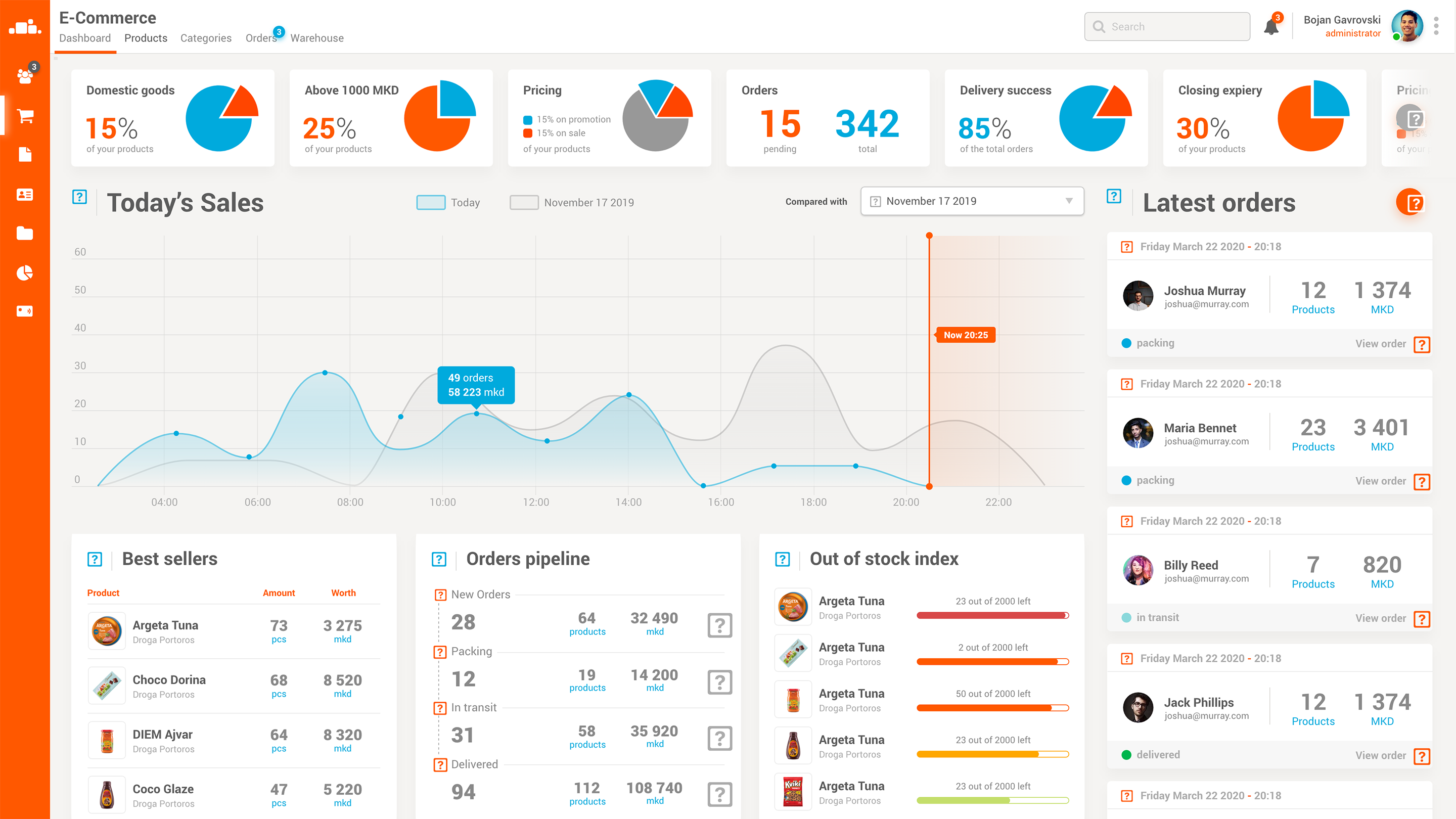
The main chart is giving us the daily signup numbers by hour. You can draw a parallel on a daily or monthly basis.

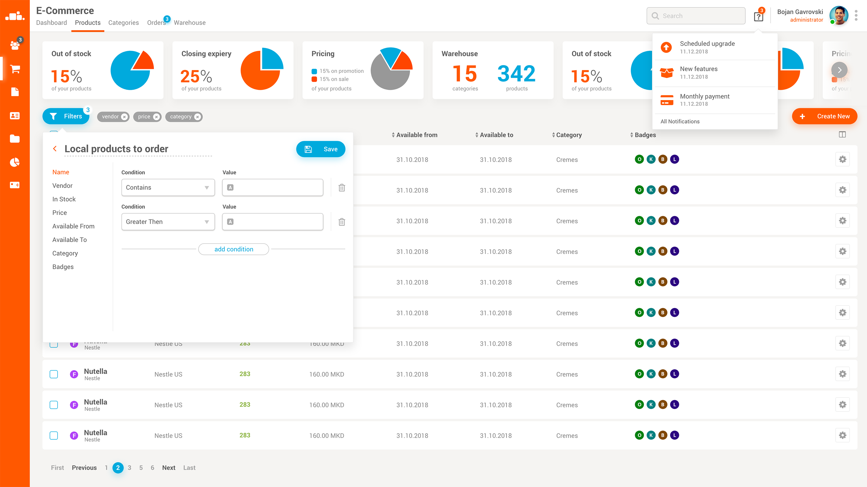
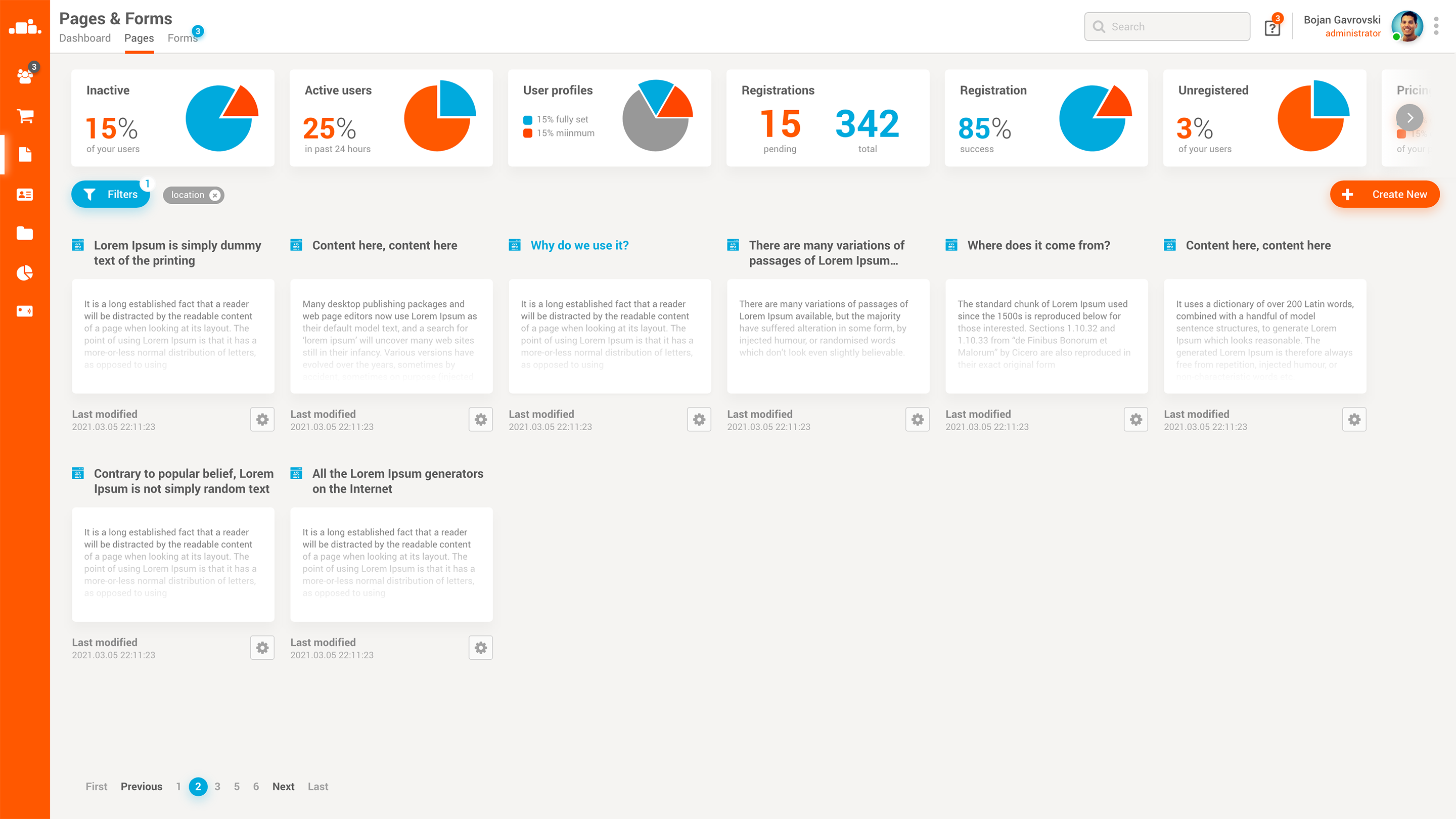
At the top there are multiple stat cards that give us a breakdown on simple statistics, like active users, level of user profile completeness, percent of people deleting their accounts, etc.

User Details

The user details is a page where we show a selected user’s details. The user info is split in multiple boxes, like general info, CRM (work) info, linked accounts, and contact information where a user can have multiple contact info sets.

Ecommerce Dashboard

Possibly the most awaited dashboard by our clients was the ecommerce dashboard. It gives you a glimpse of how your store is doing, how are your daly, monthly or yearly sales. There are three stat boxes at the bottom. First one showing the best selling items from the store. The second one showing all order and the stage they are in. The third one is our out of stock index, that shows which items are near the out of stock state.

On the right side you can see separate cards with the latest orders that happened on the system, along with information for the shopper, the amount spent, and number of items bought.

At the top there are multiple stat-cards showing info on different parts of the ecommerce module.

Orders List

Orders list is one of the many list-views in this app, with the only difference that here by default purchase data is literally divided by the creation date. This way administrators can see distinctly see the date’s purchases, along with the purchase information.

Each line contains the shopper info, price spent, status of the order, delivery date, and much more.

Order Details

The expanded view for a created order is split in three main panels. Buyer details, Delivery details, and the order itself. The delivery details contain the full delivery address, including date and time for the delivery, and pinned map with the exact coordinates of the delivery address.

On the right side we have the order details, which holds the order status, the complete (editable) items list, and the totals.

Products List

The products list does not differ from the other list views on the app, but to spice it up, we have the filtering module opened.

The filtering module allows for the administrators to create different kinds of filters which can be used to filter data. You want to see all products which have item count less than 10, are priced above certain amount, and belong to a certain category? Sure thing. Not just being able to filter pretty easily, you can also save those filters so you won’t need to recreate them when you later need them.

Products Details

Product details page is separated in 6 different sections. General information, Tags & Badges, Origin, Prices, Discounts, and product metadata.

All these are standard product sections that you may find in other ecommerce systems, except for the metadata section. This is a specialized section that allows administrators to add specialized metadata for each of the products. Of course, the metadata is “predefined” by the administrators, but that doesn’t make it any less flexible.

On the far right side of the page you may see a meta-stats bar, containing additional meta and statistical information regarding the product.

Pages List

The pages list is just a list of all “static content” pages. The se are the pages which are rarely updated and with a pretty static content. The list is shown in a way where the administrator can “preview” or have a glimpse of the content on that page, by presenting it as a small screenshot of the page.

Page Details

The page details is done in a way where all ui burden is removed and the only thing that matters is the content, and some of the page’s meta data. On the left side we have a section which allows the admin to inter the description, tags, category, publish data etc, and on the left is the content section where the author can edit the content by using intuitive UI controls.

Forms List

Similarly as with the pages list, here we also have a list of form previews although not really screenshots but more of a list of fields present in the form. There is a small number indicator that shows up in each form-card whenever here is a new form entry. At the bottom of each card we have the metadata, when the form was created and how may data records were created by using it.

Form Details

The form details is separated in two main sections, the form control, and the form data.

The form control section is the one which is used to create and edit form fields and actions. You can assign a name to the form, enable certain types of fields, decide whether you and/or the user will get any email notifications or thank you messages.

On the bottom you’ll see a data table containing all the records gathered by using the form. You are able to see the content, but also the attachments that the user sent.